A Healthy Nation?
Preliminary Health Results from the 2011 Census.
Context
The results for the newly introduced general health question from the 2011 Census have just been released (June 28th, 2012). The decision to ask such a question is laudable one and the first ever attempt to ask a question of this type. It is a self-reported question with census respondents asked to tick a box as to the health status of head of household as well as all household members. Five categories were presented to allow respondents to say if their health was; very good/good/fair/bad/very bad. Such questions are common to census outputs in other jurisdictions and have generally been found to be useful for two broad reasons. Firstly, the value of collecting this data within a census allows for much deeper spatial analysis of the patterns of good and poor health across the country. Knowing something about these deeper geographies of health will be vitally important for a number of state, semi-state and private organizations and agencies. Secondly, asking a general health question within the Census allows analysts to also explore and cross-tabulate relationships, both numeric and geographical, between health status and associated variables in the Census such as social class, education, disability and informal caring. In this way, one can analyse the potential explanatory causes of good/poor health and relate these to wider casual factors and provide good empirical material for wider social and economic profiling.
Overall Results
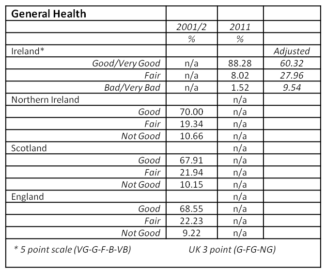
As the first time a general health question was asked in the census, the response suggests a generally good level of self reported health for all respondents. The results show that 60.3% reported they were in 'very good' health and a further 28% in 'good health'. Just over 8% recorded their health as 'fair', with a small number, 1.3% recording their health as 'bad' and an even smaller number, only 0.3%, recording their health as 'very bad'. In addition, 2.1% of the population did not answer the question. The total proportion of the population who answered Very Good or Good accounted for 88.3% of the population, which tallies well with recent survey responses of 84% for the same question as reported by the OECD Health at a Glance Report from 20091. Comparisons with country level reporting across the rest of the British Isles suggests the Irish population to be considerably more healthy than populations in those other countries. As Table 1 below shows, when compared with the most recently available data from 2001 for Northern Ireland, Scotland and England/Wales, the rates of good health are much higher in Ireland. This is likely to be for two reasons. One is that the phrasing of the question is slightly different, but more importantly, the Irish question provided 5 optional categories whereas the UK questions asked only whether health was Good, Fair and Not Good. This is likely to have thrown up significantly different responses. Given the broad level of agreement across the UK in 2001, it is interesting to speculate that recoding and re-aggregating the Irish data into three categories, as Very Good, Good and combining Fair/Bad/Very Bad as a sort of generic 'not good' response, shows a closer match (see adjusted figures in Table 1 below). The use of 'fair' in both categorizations makes such an aggregation problematic, but makes for an interesting comparison nonetheless.
Table 1 General Health Results across British Isles, 2001-2011
As the CSO's preliminary analysis suggests, there is a strong relationship for example, between social class and health, with the affluent Professional Class reporting levels of Very Good Health at 75.2% that are significantly higher than those for Unskilled Workers at 45.3%. With the release of more detailed data at electoral division (ED) and small area (SA) level, it will also be important to compare the health question against deprivation scores to further deeper our understanding of relationships between health, poverty and inequality. If results are comparable to other countries, the inverse relationship between deprivation and good health should be both apparent, and consistently identifiable down to neighbourhood level.
Geographical Patterns
As the CSO identify in their preliminary reporting, it is possible to map the rates of good and poor health by local authority and county across the country but with some important caveats at this early stage. Clearly counties with significantly older populations come out with poorer health status so to get a more accurate measure, it will be necessary to perform age-standardisation adjustments to take this into account. In addition, it is also clear that in general urban areas have lower levels of very good health than some of the 'younger' counties in their hinterlands. The CSO preliminary report provides a map of 'very good' health. But a map of a cumulative 'bad/very bad' health status, Figure 1b below shows, us a pattern of relatively high rates in the cities of Limerick, Dublin, Waterford and Cork as well as rural parts of Central Connacht, Longford and Tipperary South. Having this information makes it possible for example to compare with other regularly used indicators of mortality and morbidity, though few of these are available at any meaningful spatial scale. One example, drawn from preliminary results from a HRB Funded project being carried out at the Centre for Health GeoInformatics at NUI Maynooth shows age-standardised mortality rates for 2006 (Figure 1a). The rates are calculated for the population under 75, a proxy measure of premature mortality. While this is a 26 county, rather than 34 local authority map, the results are quite different. Updating the map to include the cities would be likely to improve the match, but it may be that the inclusion of the 'fair' category in the right-hand map might see a better correlation. In addition, deeper analysis on the disability data, as a proxy of limiting long-term conditions, might also throw up a sharper correlation.

Future directions
It is very exciting to have this new data available for visual and statistical analysis. As well as cross-tabulations and comparisons with other Census data, it may also be used to compare with proxy measure of potential health care demand, such as the % of residents in each county in receipt of a medical card and other primary care supports. In addition, the mapping of disability data may also enable analysts to uncover and verify relationships between disability and health status and explore this geographically. In the different UK censuses, there is an additional question on limiting-long term illness which typically throws up much higher rates (20.4% for NI, 18.2% for England & Wales) than for Ireland. Given the better match between the new data for people reporting a disability, 13% in Census 2011, this suggests that the re-phrasing of the question is moving a little closer to the type of question used elsewhere and acts as a proxy for chronic illness levels. One advantage perhaps of the Irish census question in its use of five rather than three categories, is an ability to really pick out those with genuinely poor health, which may also prove useful in predicting potential future demand for health services. Indeed, given the paucity of detailed spatial information on the utilization of both hospital and general practitioner services in Ireland, this may act as a subtle push to produce better spatial forecasting of demand on health services. Finally, the provision of a general health question is not unproblematic. All censuses are self-reported and therefore are, to an extent, unverifiable. The introduction of a new question, especially one as relatively subjective as health status, will always have associated teething problems. As noted above, the way in which the question is posed will also affect the results. But the data is likely to be useful in a whole variety of fields and will be used at a range of scales from local partnership work up to cross-border and international comparative scales. As a medical/health geographer, for whom any sort of health data, especially those collected at a range of meaningful geographical scales, is crucial, the CSO are to be lauded for suggesting and collecting this valuable dataset.
Ronan Foley, Centre for Health GeoInformatics.
1 OECD (2011), Health at a Glance 2011: OECD Indicators, OECD Publishing.
http://dx.doi.org/10.1787/health_glance-2011-en
2 CSO (2012) This is Ireland: Highlights from Census 2011, Part. 2. Government of Ireland.
2006 Mortality Data - CHG HRB Project, Preliminary Results


Context
The results for the newly introduced general health question from the 2011 Census have just been released (June 28th, 2012). The decision to ask such a question is laudable one and the first ever attempt to ask a question of this type. It is a self-reported question with census respondents asked to tick a box as to the health status of head of household as well as all household members. Five categories were presented to allow respondents to say if their health was; very good/good/fair/bad/very bad. Such questions are common to census outputs in other jurisdictions and have generally been found to be useful for two broad reasons. Firstly, the value of collecting this data within a census allows for much deeper spatial analysis of the patterns of good and poor health across the country. Knowing something about these deeper geographies of health will be vitally important for a number of state, semi-state and private organizations and agencies. Secondly, asking a general health question within the Census allows analysts to also explore and cross-tabulate relationships, both numeric and geographical, between health status and associated variables in the Census such as social class, education, disability and informal caring. In this way, one can analyse the potential explanatory causes of good/poor health and relate these to wider casual factors and provide good empirical material for wider social and economic profiling.Overall Results
As the first time a general health question was asked in the census, the response suggests a generally good level of self reported health for all respondents. The results show that 60.3% reported they were in 'very good' health and a further 28% in 'good health'. Just over 8% recorded their health as 'fair', with a small number, 1.3% recording their health as 'bad' and an even smaller number, only 0.3%, recording their health as 'very bad'. In addition, 2.1% of the population did not answer the question. The total proportion of the population who answered Very Good or Good accounted for 88.3% of the population, which tallies well with recent survey responses of 84% for the same question as reported by the OECD Health at a Glance Report from 20091. Comparisons with country level reporting across the rest of the British Isles suggests the Irish population to be considerably more healthy than populations in those other countries. As Table 1 below shows, when compared with the most recently available data from 2001 for Northern Ireland, Scotland and England/Wales, the rates of good health are much higher in Ireland. This is likely to be for two reasons. One is that the phrasing of the question is slightly different, but more importantly, the Irish question provided 5 optional categories whereas the UK questions asked only whether health was Good, Fair and Not Good. This is likely to have thrown up significantly different responses. Given the broad level of agreement across the UK in 2001, it is interesting to speculate that recoding and re-aggregating the Irish data into three categories, as Very Good, Good and combining Fair/Bad/Very Bad as a sort of generic 'not good' response, shows a closer match (see adjusted figures in Table 1 below). The use of 'fair' in both categorizations makes such an aggregation problematic, but makes for an interesting comparison nonetheless.Table 1 General Health Results across British Isles, 2001-2011
Geographical Patterns
As the CSO identify in their preliminary reporting, it is possible to map the rates of good and poor health by local authority and county across the country but with some important caveats at this early stage. Clearly counties with significantly older populations come out with poorer health status so to get a more accurate measure, it will be necessary to perform age-standardisation adjustments to take this into account. In addition, it is also clear that in general urban areas have lower levels of very good health than some of the 'younger' counties in their hinterlands. The CSO preliminary report provides a map of 'very good' health. But a map of a cumulative 'bad/very bad' health status, Figure 1b below shows, us a pattern of relatively high rates in the cities of Limerick, Dublin, Waterford and Cork as well as rural parts of Central Connacht, Longford and Tipperary South. Having this information makes it possible for example to compare with other regularly used indicators of mortality and morbidity, though few of these are available at any meaningful spatial scale. One example, drawn from preliminary results from a HRB Funded project being carried out at the Centre for Health GeoInformatics at NUI Maynooth shows age-standardised mortality rates for 2006 (Figure 1a). The rates are calculated for the population under 75, a proxy measure of premature mortality. While this is a 26 county, rather than 34 local authority map, the results are quite different. Updating the map to include the cities would be likely to improve the match, but it may be that the inclusion of the 'fair' category in the right-hand map might see a better correlation. In addition, deeper analysis on the disability data, as a proxy of limiting long-term conditions, might also throw up a sharper correlation.
Future directions
It is very exciting to have this new data available for visual and statistical analysis. As well as cross-tabulations and comparisons with other Census data, it may also be used to compare with proxy measure of potential health care demand, such as the % of residents in each county in receipt of a medical card and other primary care supports. In addition, the mapping of disability data may also enable analysts to uncover and verify relationships between disability and health status and explore this geographically. In the different UK censuses, there is an additional question on limiting-long term illness which typically throws up much higher rates (20.4% for NI, 18.2% for England & Wales) than for Ireland. Given the better match between the new data for people reporting a disability, 13% in Census 2011, this suggests that the re-phrasing of the question is moving a little closer to the type of question used elsewhere and acts as a proxy for chronic illness levels. One advantage perhaps of the Irish census question in its use of five rather than three categories, is an ability to really pick out those with genuinely poor health, which may also prove useful in predicting potential future demand for health services. Indeed, given the paucity of detailed spatial information on the utilization of both hospital and general practitioner services in Ireland, this may act as a subtle push to produce better spatial forecasting of demand on health services. Finally, the provision of a general health question is not unproblematic. All censuses are self-reported and therefore are, to an extent, unverifiable. The introduction of a new question, especially one as relatively subjective as health status, will always have associated teething problems. As noted above, the way in which the question is posed will also affect the results. But the data is likely to be useful in a whole variety of fields and will be used at a range of scales from local partnership work up to cross-border and international comparative scales. As a medical/health geographer, for whom any sort of health data, especially those collected at a range of meaningful geographical scales, is crucial, the CSO are to be lauded for suggesting and collecting this valuable dataset.Ronan Foley, Centre for Health GeoInformatics.
1 OECD (2011), Health at a Glance 2011: OECD Indicators, OECD Publishing.
http://dx.doi.org/10.1787/health_glance-2011-en
2 CSO (2012) This is Ireland: Highlights from Census 2011, Part. 2. Government of Ireland.
2006 Mortality Data - CHG HRB Project, Preliminary Results
